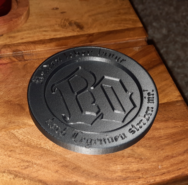
Böhse Onkelz Coaster / Böhse Onkelz Untersetzer
Remixed by
Boost
2
7
4


Print Profile(1)

0.16mm layer, 2 walls, 15% infill
Designer
1.4 h
1 plate
Boost
2
7
4
0
14
16
Released
Description
The letters in the middle are a little more deepened and those on the top edge are a little flatter
CHEERS FOR GOOD
Comment & Rating (4)
All

Böhme Onkelz coaster🤩 Dann sprichst du anscheinend deutsch 😅
The designer has replied
1
Reply

jau 😂
0
Reply
Dann Ost das einfacher🤣
0
Reply

Print Profile
0.16mm layer, 2 walls, 15% infill
1
Reply
No more
This remix is based on
License
This work is licensed under a
Creative Commons Attribution-Noncommercial-Share Alike


© 2024 MakerWorld